Bordering Regions
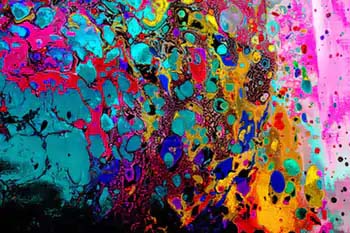
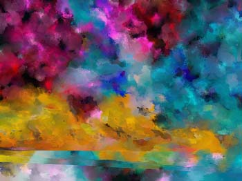
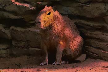
A somewhat new feature that I've been working on... Basically, a lot of settings will create awful images, mostly from disparate colors in little patchy blotches. For a long time I thought this was a blending issue but realized it's simply the fact that not all color combinations look good. Here's an example of a bad looking image:
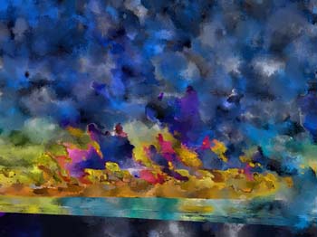
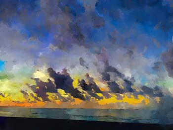
Awful right? Well the idea behind this feature is to give some priority to bordering regions having similar colors. It's sort of blending but is really just increasing the odds that a border region will be visually similar to it's neighbor. On this particular images, it smooths too much and we lose all our saturation:
The results make sense, each region latches onto it's neighbor and the color filters throughout the whole image. If we constrain this logic a bit (by adding the Used Up features we get something like this:
Normally I would nudge more value into the calculation and get something like this:
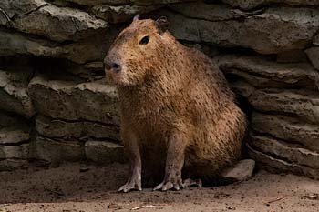
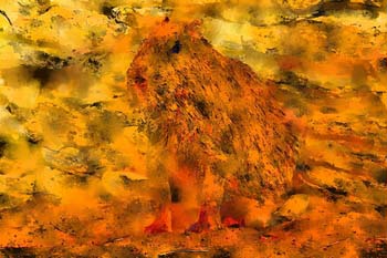
Better, but still doesn't look great. Note, the splotches are my least-favorite part of Color Cosm. Initially I thought it was a blending problem (I'm sure part of it is blending). Here's an example of two mappings with the same regions. The first is a hue-only mapping:
Every bordering region is a little bit random as the program struggles to find matches. However, if doing perceptual value mapping, here's the result:
Blending is nearly perfect! Same regions, same blending, just disparate colors.
I've done some work recently trying to solve the blending problem and made some headway. I implemented a stage right after segmentation where we blend regions based on how visually different they are:
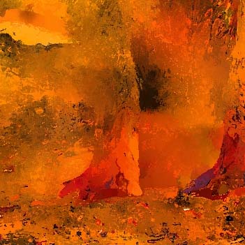
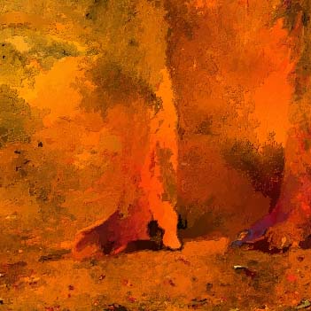
It's looking better but by no means "done" yet.

