Saturation Mapping
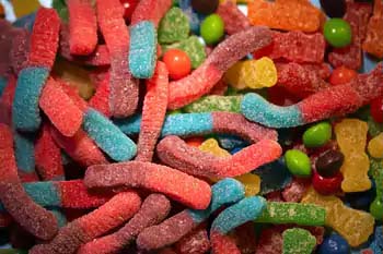
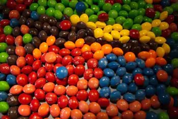
The concept of saturation is pretty straightforward, but the results not so much. You don't always get what you expect. Again, let's play with candy:
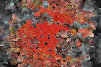
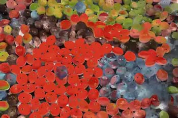
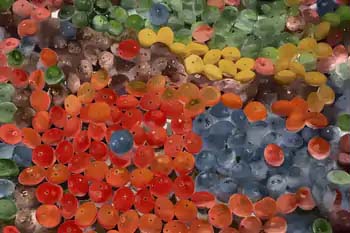
So here the most saturated colors in the worms map over to the brightest skittles which have more intense color. Why do the less saturated/darker skittles look grey? Well, the program didn't find a good match for that saturation level between the two images. If we want to reduce the grey, let's combine hue and saturation parameters and see what we get:
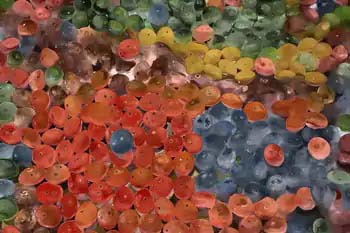
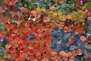
That's a bit better but I think the reds are too saturated. Let's increase the probability that the hue is matched over the saturation:
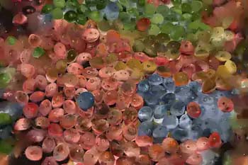
Those last 3 are subtle but I like the last one the best. Ok, let's compare the final result:
From a distance, our final result looks an awful lot like the first "Hue Mapped" image. But there are subtle differences:
Another example that's interesting:
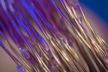
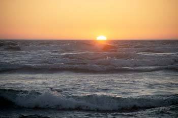
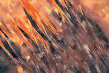
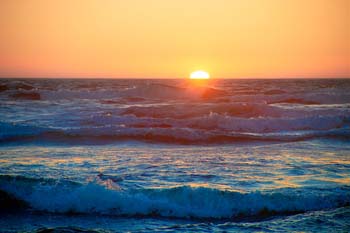
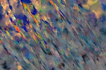
The sunset orange is more saturated than the ocean waves. So in a saturation-only mapping they go right to the blue-ish purple in the upper-left of the wires, which have more intense colors. But if we do a hue-only mapping we get this:
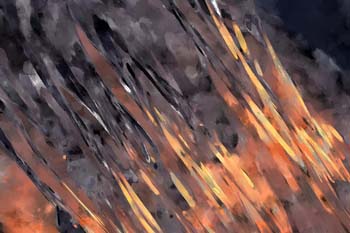
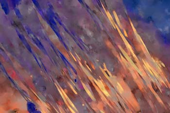
Pretty much the reverse because the less saturated ocean waves (which are nearly grey but have some blue) match the hue of the bluish-purple wires better.
Out of curiosity I created a version of the sunset with some absurdly saturated blues and got these results:
Wow, that saturation-only images looks awful now. This is a great example of creating an ugly image. The program doesn't know that the mixture of highly saturated oranges and blues don't look good all merged together. For more discussion of this see Bordering Regions.
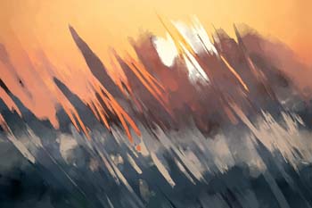
While I'm talking about this set of images, check out one of my favorites from these two:
It uses a combination of parameters together (saturation, value, and location) to create something I never quite expected.

