All Used Up
This feature needs some work, but has a lot of potential. The idea is this: we have an image mapped with hue or just saturation. That works fine, but you want the result to look a bit more like the color image. But you don't want to use location mapping where the image correlates so closely. Instead you want the percentage of original colors to be the same in the final image. So if the color is mostly red, a little bit of yellow, you'd like the ratio nearly the same.
Several ideas came to mind to solve this (see Warping). The first was that we track when colors are "used up"—that is, when we're mapping we stop doling out red if we've reached the % of red in the color image.
I've attempted to do this and it's been more difficult than expected. Coherence is difficult (you just get splotches of a color randomly). The bordering regions feature can help this at the expense of blurring and saturation reduction.
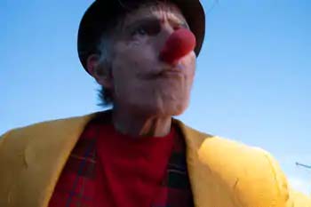
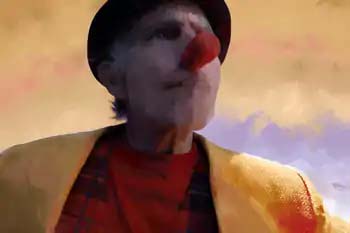
However, here's a starting example based on previous described features:
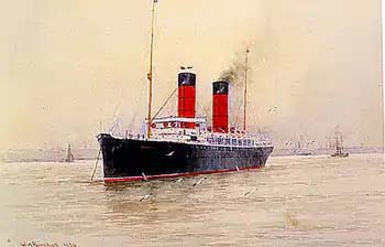
Interesting. Notice where the red went from the smokestacks to the nose and shirt. Also, it's really interesting how much yellow showed up. You don't see much yellow in the boat picture. This might be a bug but I do see some very yellow pixels in the low-resolution boat pic (unless you use this "used-up" feature the program doesn't care how small the color pixels are—it will use them).
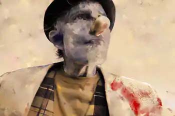
But what if we force the program to allot only the amount of red we've given it?:
Notice how little red there is now? Only it didn't go to his nose... There are interesting ways to guide where the color goes, see Using With Other Programs
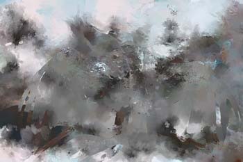
Here's another example:
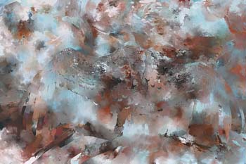
Note, the amounts of colors percentage-wise from the color image isn't the same in the output image. Here's a version with "used" turned on:
Notice the difference? It still doesn't look that great but you get the idea. More work needs to be done.

