Value Mapping
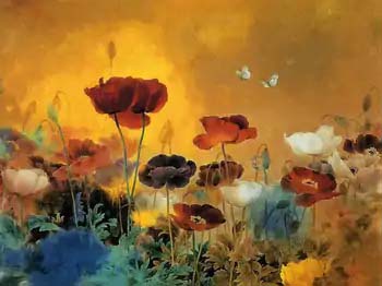
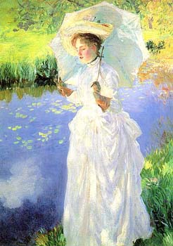
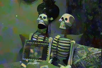
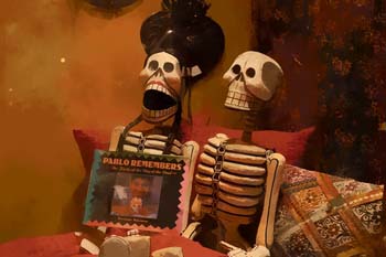
So what if we want the tonal values (light/dark) to more closely matched the qualities of our destination image? Well, here we go:
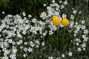
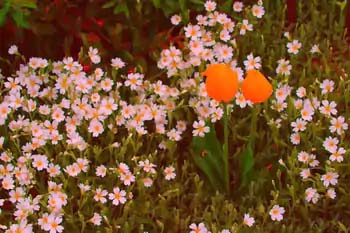
More realistic? This has been the more traditional approach to color mapping, somewhat... As a comparison, take a look at what Corel Painter's Match Palette does to these flowers:
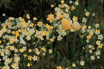
Compared to this guy (hue and value mapping):
There's not a huge difference but I find the Color Cosm version much more appealing. However much I try I can't get good results from other programs. And of course, Color Cosm can do a lot more than just value mapping. It's power is in combining value mapping with other competing parameters.
When writing the program I started out with only what I call "value mapping". But then I started delving into more accurate "perceptual" mapping. This color theory is based on some complicated math that more closely matches the way our visual machinery sees light. Here's an example:
It looks similar to the normal value mapped method but here's a closeup side-by-side look:
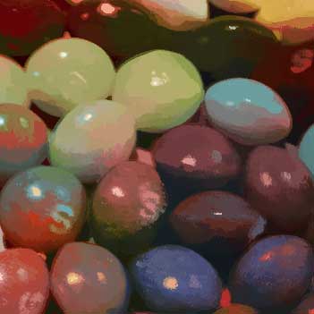
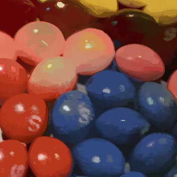
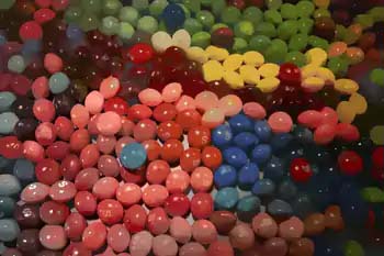
Another example where the difference between the normal value mapping and perceptual mapping can make a huge difference:
Notice how you don't see much red in the second image? Right now the value mapping algorithms will latch onto whatever colors they can find that seem to be the most accurate. If you add different parameters this is less likely to happen.
And for fun, let's go backwards and look at how Corel Painter's Match Palette feature looks:

